Australian Olympic Committee launches simplified Olympic logos ahead of Rio Games
 The Australian Olympic Committee (AOC) has modernised its branding to bring multiple groups together under one banner.
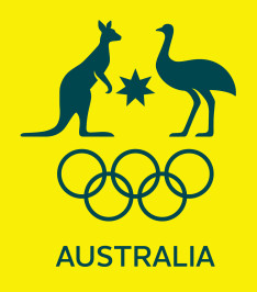
The updated designs feature simplified depictions of a kangaroo and an emu, along with the star that represents the states and territories of Australia. The iconic references sit above the Olympic rings, and will be used to combine the committee with the team and fans.
The redesign was prompted by new guidelines introduced by the International Olympic Committee (IOC) reducing the number of marks a National Olympic Committee can use. The latest green and gold design will be worn at the Rio Games next year.
A statement from AOC said: “For the first time we’ve looked at our two Olympic marks, the crest and rings and the flag and rings and brought them together.


Wouldn’t the addition of all of the southern cross stars make more sense than the solitary one star? the balance between the two animals looks out of symmetry.
Is it April 1?
@Jason – Five countries have the southern cross on their flag. Only one has the Federation Star.
Reminds me of “a camel is a horse designed by a committee”.
There should be a ban on using the word “design” unless there’s some actual design involved.
I reckon the kangaroo wants to punch the emu in the face.
you’re a ‘make the logo bigger’ kind of guy arent you.
What’s happened to the Boxing Kangaroo?