Nine relaunches Wide World of Sport website with live scores and more video content
Nine Entertainment Co has relaunched its Wide World of Sports website as part of Ninemsn’s overhaul of its website portfolio.
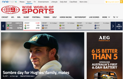
The new “fully responsive site” which resizes depending on the device it is being viewed on offers users in-depth sporting commentary and analysis as well as the ability to track player movement, watch every play, every hit, every tackle and goal.
Ninemsn editor and publisher Hal Crawford told Mumbrella the relaunch was part of Ninemsn’s plan to modernise all of its websites.
An article about a new website without a URL in it.
Hello? why do journalists continue to do this. Please provide a source to the topic you are actually writing about.
Thanks
Quick critique:
Looks outdated/state for a 2015 launch
Background on header appears to resemble a carpet texture
Logo has unnecessary (and likely to conflict with brand guidelines) drop shadow. The red logo is not congruent with the blue colour that is traditionally associated with the brand. Odd choice.
Rest of the site does not conform to any brand identity/colour system. Seems like ‘microsoft office’ was chosen as the colour palette. Suggest ninemsn colour palette used as site is within brand/site structure ecosystem.
Sticky content is poorly integrated into RHS only. Should also include at footer of article and pull related content – not just ‘most popular’. (on second review – there is 2 related article content types at end of article but this is not signposted for the user whatsoever and most images are default logo – does not get user traction).
Navigation should have been a fixed approach – ensuring the user can access the category listings easily, instead of scroll back to the top of the website. ‘Back to top’ anchor hyperlink is hidden in the footer detail – should be raised up in priority and given a visual cue for the user (ie. arrow/icon)
No apparent access to “TV GUIDE” which should be first and foremost consideration of a television channel website.
Menu “more” contains a sub item “all more”. This does not make sense grammatically. Suggest change to “view all”.
No visual cues used on content modules to differentiate gallery/video/article/report etc.
Content does not have any form of hierarchy structure. Eg. Latest/Editors picks/Current sport/features etc. Just random content blasted onto a page.
Most articles are written by “AAP” – who is AAP? Give editorial team a presence and real names.
No modern user control ie. Favourite sports/show me more of this type/customise etc. Quite outdated in this respect.
Report card: 4/10
I am still clicking around trying to find this thing.
Mumbrella journalists should be trained on how to incorporate a hyperlink into their articles, rather than just a screenshot (which could also act as a hyperlink).