RSPCA Approved evolves into RSPCA Certified, powered by Nature and The Thrills

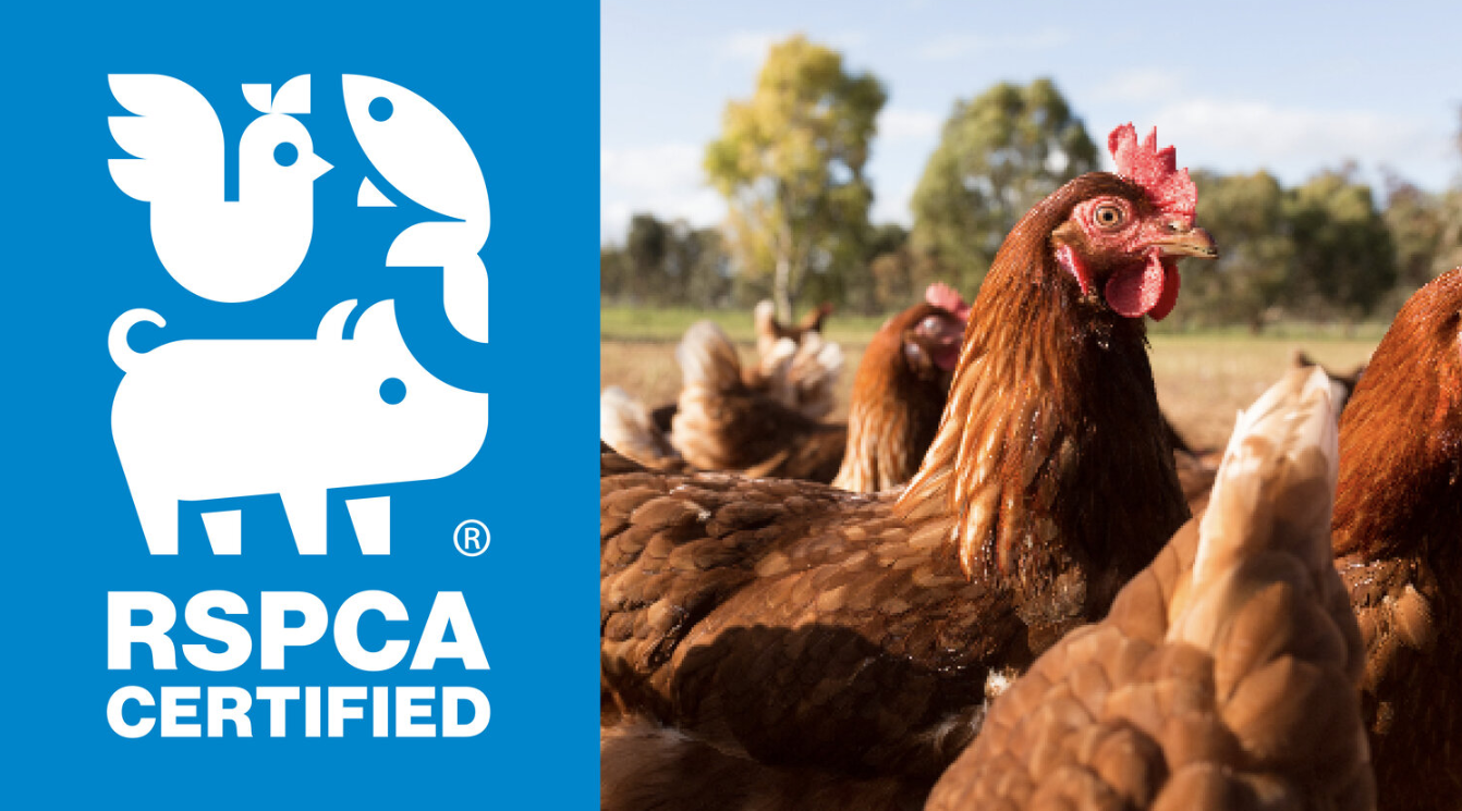
RSPCA Australia has launched a new branding initiative, RSPCA Certified, to replace the RSPCA Approved Farming Scheme. The rebranding aims to strengthen consumer trust and improve recognition of higher-welfare products in the market.

The announcement:

RSPCA Australia’s renowned farm animal welfare certification program now has a new name – RSPCA Certified – and a refreshed brand strategy and identity, with strategic advisory firm Nature leading the rebrand in partnership with creative agency the thrills. 

17 years since the last brand refresh, the newly launched RSPCA Certified brand will replace the existing RSPCA Approved Farming Scheme, to help consumers and stakeholders cut through the current slew of misleading marketing and labelling to identify products that meet the stringent animal welfare standards developed and implemented by the RSPCA. 

The updated brand, which comes with a revamped strategy and visual identity, reflects both the program’s rigorous assessment standards and its commitment to ongoing improvements to industry practices nationwide. 

The RSPCA’s standards go well beyond what’s legally required in Australia – there are hundreds of requirements within each animal-specific standard, focusing on improved housing conditions, lower stocking densities, quality enrichment and low-stress handling. 

Nature Head of Strategy Aliya Hasan said the collaboration between Nature and the thrills was built on a long-standing relationship, shaped by previous branding projects and a shared creative approach.  

“We received the brief from RSPCA Australia and engaged the thrills to spearhead creative development, while Nature led the rebrand as a strategic step to make the RSPCA’s comprehensive and credible farming certification standards the core brand platform.” Aliya said. 

“We treated naming as a critical strategic lever. ‘Certified’ communicates verification and ongoing assessment of standards in a much clearer and more compelling way than ‘approved’, which can imply the job is done.   

“That seemingly small but powerful word change, along with a streamlined brand architecture, strengthens the program’s role at shelf and supports a more consistent system across packaging and partner touchpoints to ultimately help consumers make conscientious choices.” 

The refreshed program replaces the previous RSPCA Approved Farming Scheme on-pack identity, which was less explicit in communicating ongoing improvements to welfare standards. The new RSPCA Certified Welfare Standards logo signals assessment against the higher than legal RSPCA standards, while the unified brand architecture improves recognition across all protein types.  

The Thrills Managing Partner Kate Richardson said the new visual identity brings the RSPCA Certified brand to life across packaging and retail environments. 

“We developed the visual identity and guidelines for RSPCA Certified to create a system that is distinctive, usable and consistent at scale,” Kate said.  

“The refreshed use of the iconic RSPCA blue strengthens memorability and cut-through, while the combined animal icon acts as a unified symbol representing all animals raised to RSPCA’s standards, reinforcing collective commitment and credibility. 

“Shaped over several years of consultation with stakeholders, the system is designed to work across on-pack, in store, foodservice and advertising environments as the certification transitions.” 

Consumers will continue to see the previous and new logos on product packaging and in menus as businesses progressively update their product packaging and marketing. Both logos indicate the products are from RSPCA Certified farms, and in time the previous logo will be phased out entirely.  

CAMPAIGN CREDITS:

Strategy, brand architecture and insights – Nature 

Key personnel – Head of Strategy Aliya Hasan, Director Lizi Pritchard, Associate Director Jesse Ball and Senior Consultant Hannah Ahthiong 

Visual identity and creative – the thrills 

Key personnel – Managing Partner Kate Richardson, Creative Director Paul Greskie, Client Director Gemma Tedford, Design Director Katie Richardson and Designer Tim Arnold  

PR agency – Soda Communications  

Get the latest media and marketing industry news (and views) direct to your inbox.

Sign up to the free Mumbrella newsletter now.

"*" indicates required fields


SUBSCRIBE

Sign up to our free daily update to get the latest in media and marketing.