AGL puts sustainability and digital experience at the forefront in brand refresh
Energy giant AGL has refreshed its brand and launched a new campaign drawing a line in the sand over sustainable energy supply, pledging to end its reliance on coal.
 The campaign is the first work since the architect of NAB’s award winning Break Up Campaign, Sandra de Castro, joined the company in November.
The Cannes Grand Prix winning break up campaign had a massive impact on setting NAB apart from its rivals in a market with little differentiation and de Castro told Mumbrella AGL was faced with a similar challenge.
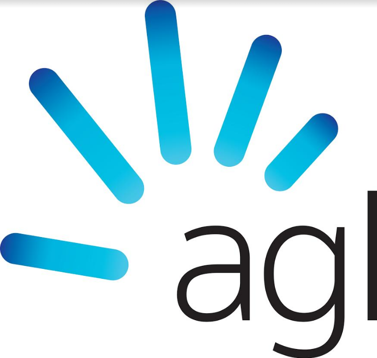
AGL has refreshed its logo with a new stylised “gas burner” and adopted sustainability and digital user experiences as the core of its message.
“The architect of Break Up”.
Break Up happened despite Sandra, but don’t let that get in the way of a good story.
Isn’t it ironic that they’ve chosen a fossil fuel to be part of the logo when the focus is on sustainability and renewables…?
Appropriating the success of NAB Break Up to this is shameful marketing. I’m sure the agency and all others involved are cringing.
It also begs the question, why no agency quotes or reference?
Perhaps because one campaign came from deep cultural understanding and creative prowess, whereas the other is generic category wallpaper?
It’s like my upturned left hand ….fingers of gas and palm of coal….
“Architect of NAB’s award winning Break Up Campaign, Sandra de Castro.” Says Sandra de Castro, who is still writing her own press releases.
This is category generic wall-paper.
So how’s that ‘break up’ thing going?
Been a while since someone referenced that one as a personal triumph.
You might need to refresh a few memories on that one…
Sorry, is this article about Sandra, nab or AGL? I’m confused.
Wouldn’t it be fascinating to see what happens when a company doesn’t change it brand and strategy like underwear, when a company doesn’t treat customers like pawns on a chessboard and is actually honest about its true purpose?
Why not be the first company to get rid of the ‘discount’ on your energy rates bullshit?
Get rid of ‘market rates’, get rid of disclaimers.
Make it simple, make it clear, and stop playing the old mobile plan game of cost and usage algebra obfuscation.
Why not actually change the game?
Why not do more than just say you’re different?
Why not do something tangible so that customers see a real benefit and a real difference?
To quote John Kennedy Snr (one of Hawthorns other great coaches) – “Do. Don’t think. Do something.Do.”
It’s time to break up with the other energy retailers Sandra.
Maybe you could tailor energy to their needs, or tell them AGL is more than energy?
Are you with me?
This is it. Well said.
totally with you. me and you all the way.
Very well put sir!
Changing a logo means little. Actions have always spoken louder than words and now ‘the people’ have social media. Start doing stuff that wows the people and they will sell your product for you. It is really as simple as that.
I work for one of the agencies involved – it is a really clever logo. Inspiration is a hand (control energy from an app), that animates into all types of energy sources – solar, wind, water, and yes fossil fuels too. It is a nod to digitization and power in consumers hands.
I work with the AGL brand through my workplace. The logo only works when it’s got the new brand fully behind it. As a stand alone brandmark it is very poor and gets overrun by any surrounding elements. It’s currently getting torn apart during the brand transition.
How do you mean Waz?
Oh dear. That logo is terrible! Who signed off on that?
Ok I didn’t like nab break up. But it happened.
Let’s be honest that ad sucks. Way to go AGL for joining the 21st century and giving customers a mobile app. I guess for a dinosaur like AGL this is big news.
Wow, this rebrand stinks. I actually liked the old logo. It had a nice presence to it. This new one feels so light and pissweak.
Joe have you actually seen the old brand in the lock up with Energy in Action? It is recessive branding – really bad
Totally agree Joe. One of the weakest logos I’ve ever seen. Sandra would have been better off designing the brand herself in MS Paint and pocketing a big bonus!
What a bad joke.
Everything behind the new branding is great. The logo is just terrible. I get the concept of the hand but the font chosen to support it does not pair very well.
https://www.facebook.com/350.orgAustralia/videos/1385528948178864/?utm_medium=email&utm_source=actionkit
Spin any way you like AGL
Making sustainable energy affordable? By getting huge Government handouts from taxpayers? You have to do more than provide a pretty ad, AGL has been ripping of customers, private and business and our environment for too long.
Until AGL genuinely and completely move out of unsustainable and environmentally damaging coal, and coal seam gas, few will be genuinely impressed.
I stood in front of the agl building today and remarked at what a poor cheap looking rebrand this was. Digitally the font if reduced would be lost due to the type weight. And the gradient fingers / flames / failures whatever you call them are amateur. Something representive of a student or first year graduates work. It has little design sensibility. Lipstick on a pig.
What a load of garbage. So as a nation we are selling huge amounts of coal for other nations to use, but companies like these jokers are getting out of coal…net difference to global pollution…zero!! Net cost to Australian consumers…blank cheque to these poodle fakers. This ad and it’s entire premise is offensive.
Who is the actor in the ad?
This logo is obviously designed by a print designer with little understanding of the digital sphere.
Look at its implementation on digital devices, it is in effect smaller.
Look at how it appears on mobile it’s tiny and look at the desktop version for how the banner of the website has to make way for it.
This is why marketing and print branding experts should be kept at arms length from digital.
Ausnet Services has already launched an app which gives real time powe usage and bill forecasts. Behind the times ‘AGL’, ops I meant ‘agl’.
Facebook is a fantastic place to post pictures of your
customers together with you in the office.
Google has a different form of energy that extends well beyond how marketers behave on .
These reports is going to be open to Ad words users within the following weeks;
however advertisers (Google’s customers) must have Ad – Words Conversion Tracking enabled.