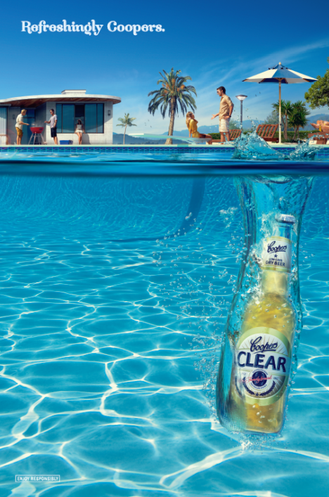
Coopers Clear goes copy free
Adelaide agency KWP has unveiled a new direction of advertising for Coopers with an almost copy free ad for Coopers Clear.
- Creative Director: James Rickard
- Creative Team: David Ormston, Amrit Jandu
- Media Team: Christine Phillips
- Account Team: John Baker, Tristan Glover, Jock Auld
- Production Team: Micky Grant, Nic How
- Art : Jodie Kunze
- Client Team: Glenn Cooper, Claire Filsell, Rachel Cooper-Casserly
- Photography: Leonardo Vilela
- Producer: Flavio Albino
- Production House & Retouching: Platinum FMD


me likey
Copy free and totally devoid of any idea.
Mad props to David Hockney for A Bigger Splash – it’s a good ad. waaay better than their awful blackboard art ones
Drinking a Coopers Clear is as refreshing as diving into a pool on a hot Summer’s day.
Do I win a prize?
It’s just a nice visual ad.
Don’t try to over-think it.
It’s not copy free at all. Apart from the two word line, there’s copy all over the bottle.
Heard of Cannes guys? You might see a few copy free print ads in some of the annuals, although the trend has kind of worn thin.
I really like it, simple, effective and would look great on large advertising displays, especially roadways and airports, where time is of the essence in capturing your target market as they zoom past. Well done.
It looks nice..but there’s just nothing Coopers about it…it could be an ad for any clear glass bottled beer…coming from one of the most distinctive & authentic beer brands – a little dissapointing, maybe like the product..
agree with TR
TR I think that’s the point. This beer is nothing like other coopers beers. Its aimed at a clear bottled drinking audience and therefore has an (really well done) ad to match. Not an audience that will roll their beer to distribute yeast sediment, pour, smell aroma then savour taste.
Is anyone else out there getting tired of seeing the word ‘refreshing’ in beer/drink ads? Wasn’t the image of a beer in a pool refreshing enough? Did Coopers not have faith in that imagery? Hmmmm.
At least the ad appears to be devoid of hipsters.
here here The Fence and TR! what were they thinking…
The great shame is that the beer is in a clear bottle. Beer can get light struck, also called skunk, because of the smell. That’s why beer is normally sold in dark bottles. In order to stop skunk, the beer maker uses an artificial hop, this is what gives the beer a chenical smell. I think the ad was made before the beer…..
Un-refreshingly Pedestrian. I concur TR, this isn’t where the Coopers brand should be.
I wonder what they are cooking on the BBQ. Me hungry.
JDC – just because you can, doesn’t mean you should…a brand that loses disctinctivity is a bland, and no-one wants those…
Yawn.. devoid of copy and creativity.
Is this stupid opinion day or something? The ad is simple, pretty and effective. It doesnot require nor involve any faux intellectual brand wankery to do its job
Overall I don’t mind it. Will it make me rush out and buy a Cooper’s Clear? Probably, because that’s what I drink anyway, because I’m a big fat South Australian who thinks that drinking low-carb beer is somehow good for me and will make me lose weight. I’ll look skinny and young, just like the people in the picture. Cool!
Clearly the hero is the beer and it does look refreshing, but as a pool owner, what pisses me off is that some bastard has dropped glass into the pool. Anyone bringing glass within 20 metres of my pool will be shot on sight.
And the background is odd. It is a stylised representation of what? Is it a hotel pool, or a backyard. Thank God the people in the background all appear to be adults. ‘Cause after they’ve downed a few Clears and dropped broken glass in the pool, any kids who don’t drown cause there’s no pool fence, will surely slash themselves to ribbons on the glass.
All this typing is making me thirsty.
Agree with David Ogilvy. Lots of hate going on… amusing to say the least, as it makes KWP and Coopers look like they hit a home run. Can anyone get me the number of the girl by the window? 😀
I like this for summer. Sometimes just the visuals are enough.
I’m suprised that no-one has ever mentioned that Cooper’s Clear is in a bottle that is a complete representation in colour & style to Corona.
You know Corona? It’s the beer that you pay $50 a carton for, or approx $10 a 330ml bottle at a trendy bar… and.. you get LEMON!! (That’s $240 a carton!)
Corona in a cantina in Mexico is 50c to $1.20.. and you get LIME!!
Australian males have bought the pup with this manure… and it will never be fixed.
Well done to Coopers for their understanding and smart marketing.
It’s not difficult to make the idiot herd follow nowadays..
Additionally, after enjoying C/Clear, I have tried some of the other Coopers products. A good range.
P.S. I love the shallow comments ’bout pools & summer etc. They have you caught in your little life & time!
Agree with RedMerlot. Write more comments with insight like this. Makes a change from the pithy pissed off comments usually associated with blogs. Love the last line. 😀