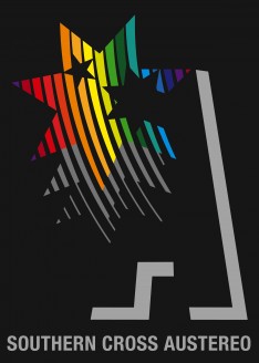
Introducing the new look Southern Cross Austereo
 Newly merged radio groups Southern Cross Media and Austereo have announced a new company name – Southern Cross Austereo.
The $700m deal took place earlier this year with Southern Cross CEO Rhys Holleran taking the helm of the new group.
Previously Southern Cross was more of a regional player, with Austereo bigger in metro markets.
Holleran told Mumbrella: “We are trying to position this in the market as one company, with one offering.”


That logo makes me want to vomit.
@anonymous
Isn’t that the concept?
“familiar yet progressive” is she living in the 80s?
Dunno about the rainbow colours – bit too 1970s revival
Southern Cross Austereo or “Scary-O” for short.
A lot of great comments on the logo but not about the product.
I think it’s quite formidable product and will do quite well.
That is the most ridiculous blend of two brands that I have ever seen. It’s like both businesses don’t want to let go of their image and identity. No need to treat the market like children. We all know the businesses are now combined without sticking one logo over the other.
$700 million and that’s the logo. I understand the need to combine the two companies but oh my golly gosh.
Is this a joke?
That is possibly the ugliest logo design ive ever seen. She might have led it but it looks like 20 people all had their input and she couldn’t work out what to do – so she just loaded it all in there
Smells like design by committee to me
Introducing the 2-GAY FM network lol
Looks like what the next Ansett logo would have been, had they still existed.
Their video has all references to cross platform TV media properties. That’s fine to claim as long as you are a client looking to reach one of the 20 people who still live in a country town
It took me 10 minutes and some Googling to work out what those random grey lines are – how exactly are you supposed to see that that’s an “A” without knowing what the original logo looked like??
@ anonymous: Population of regional Australia is 8.5 million people, most of whom live in cities and towns. Or are you just being a d%ckhead for the sake of it?
If the Oakland A’s had a gay team that could be their logo.
The benefit to Austereo on this deal is next to nothing. Apart from retail and government, regional is not even on the radar of marketers and it’s the first to be cut. The only thing austereo are going to get from this is more focus on their un necessary resources and costs.
That’s why there are so many Austereo CV’s in the market at the moment
@ Gargamel – you’re my hero.
That logo is an abomination
Newsflash – mumbrella readers hate on logo. Shock!
Criticism on here might actually mean something if it didn’t happen EVERY SINGLE FRIGGING TIME.
My new sales strategy is buy Austereo metro and get regional as bonus
The merger of two companies whose stand alone organisational cultures are at the absolute opposite ends of the spectrum…..literally like oil and water.
I really hate how regional areas are ignored in this industry.
WTF – its clearly about heritage of two strong brands. Don’t know where the rainbow came from, but whatever. It’s different to the usual corporate dross.
Hope they did not pay too much for logo
Easily. EASILY the shittest logo ever created. It’s almost offensive to logos, to call that a logo.
Infected by the Nyan Cat.
That logo is comical
Is everyone on here that’s bagging the logo and signed in as anonymous from Southern Cross Austereo?
And now we just wait for the next two installments of the story
2/ Scary-O announces lay offs….
3/ Scary-O to sell under performing assets…….
We all know the process, financial boffins see two business, and think wow lets put them together and…… well you know the rest
Logos hardly matter anyway so who cares other than the usual cadre of hating muppets who need a daily target for their vacuous, infantile venom
Please don’t take this as a negative or critical comment, but merely as an observation.
It appears that there is a recent trend on Mumbrella of posts that vehemently object to people (or even a cadre of hating muppets) who post negative comments. Ironic eh?
As a flat 2D logo, it looks awkward and out of place. Google has a lot to answer for in companies trying to go ‘rainbow’. Get it wrong, and it looks like someone lost their crayons.
However, the 3D animation redeems it a bit. The grey lines still look horribly out of place but then I suspect the animation company were trying to polish a turd there, so hats off for their efforts.