McCann launches ‘Should’ve gone to Specsavers’ outdoor ads
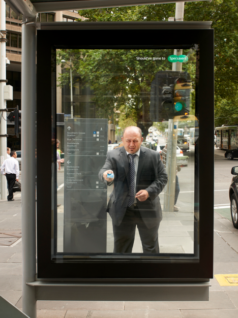
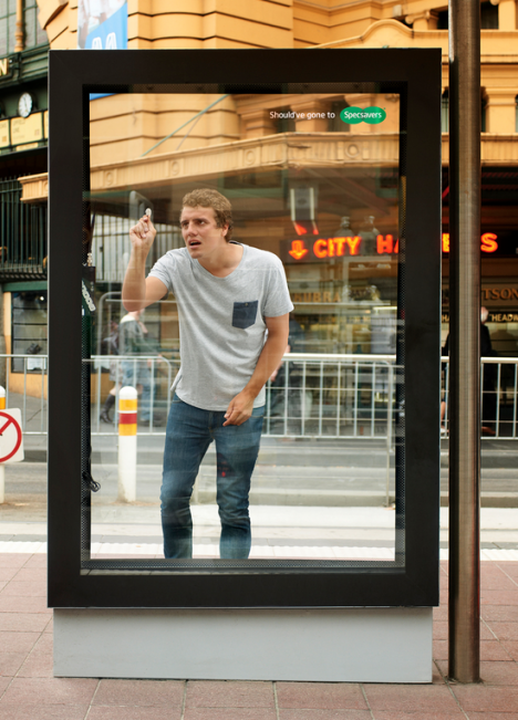
McCann has launched the latest incarnation of the ‘Should’ve gone to Specsavers’ campaign with a series of bus shelter executions for the eyewear retailers.
The posters were printed to look like there was someone on the other side who’d mistaken the bus shelter for another similarly shaped object in the city – a vending machine, an ATM and a door.
 “Specsavers’ iconic positioning allows us to continue to create entertaining and fun ads that resonate with consumers,” John Mescall, ECD at McCann Australia & New Zealand, said. “Outdoor is a great medium for Specsavers, as this is exactly where poor eyesight can lead you astray.”


Most use of small format outdoor is terrible but this is great! However the branding may be a little hard to spot for broadcast traffic.
Love this idea.
Very clever.
Love love love this creative!
Agree- can’t really see the brand unless up close.. but perhaps we should all go to SpecSavers!
Fantastic idea. Logistically difficult to scale perhaps, but fantastic nonetheless.
This is GREAT creative. Love it.
Great creative? You might all have your eyesight but no insight.
This is a category generating campaign at best and a waste of specsavers budget at worst. “oh yeah, I ought to have my eyes checked – better book with my local optician ‘ what’s their name?”
Did you miss the bit where it says “should have gone to…”
Great creative…and a fun idea. I wear glasses and would have gone to spec savers except i couldn’t read the brand. Oh dam you art directors…you have to suck it up…the brand has to be on advertising….I know it gets in your way…but there you go!!
Winner.
Very simple and clever
Its an advertising employees dream-but a minor distraction in the real world
I’m so so sorru, you guys get off on this-well, its your job-its totally ignorable and too clever by half- not what you need or wan t
Lovely outdoor for a brand I don’t recall seeing much from before.
Must be new work from a new client? Hope there’s more to come.
They won’t look as good in real life. They’ll just look like posters in a frame. These images make them look good.
Very nice idea and engaging for pedestrians – but logo is much much too small.
I think their next ad campaign be a magic eye one, reminiscent of the 90’s kids books…
Nice idea. Terrible choice of panel locations. What % of small format roadside is pedestrian? Very little. Great on Oxford Street in London. Not so great on the side of a highway!
All marketing people here say: “MUST MAKE LOGO BIGGER!”
This is a nice example of how you dont have to target every person who ever existed with every ad you make. the ones inside the bus shelter work best since it forces the viewer to sit in the correct position.
I think this is fantastic. Awesome idea and creative execution.
Au contraire. Every bus I went on in Sydney was full of people, especially the 333.
In Auckland some bus shelters have ‘art’ ads sandblasted into the glass which make beautiful shadows on a sunny day. Class.
I don’t understand why some commenters find this a bit pedestrian. Drivers already have good specs . . . hopefully.