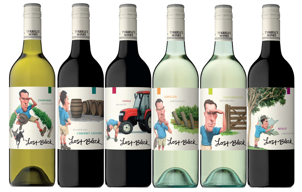
Tyrrell’s Wines has launched a full redesign of its Lost Block range by specialist wine label design studio John Jewell Design. The design tells the story behind the subbrand.
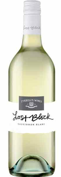
The previous label
Be a member to keep reading
Join Mumbrella Pro to access the Mumbrella archive and read our premium analysis of everything under the media and marketing umbrella.
Get the latest media and marketing industry news (and views) direct to your inbox.
Sign up to the free Mumbrella newsletter now.
"*" indicates required fields
This website uses cookies for proper functioning and enhancing the user experience. By clicking 'Accept' on this banner or using our site you accept our use of cookies. You can also 'Read More' to view our Cookie Policy and learn how to control them. Read More
I drink a lot of wine and I have no idea why but I always tend to go straight for the clean, white conservative label. The novelty label always looks cheap and nasty and not something you’d want to pour for guests. Makes you look a bit of a wine luddite. But that might just be me.
Interesting – I would have thought wine purchasers are driven by a conservative brand package. Full marks for putting it out there!!!
Whose crazy idea was this? Why would a brand trying to set itself apart think putting a comic-book look on its label will help sell wine? I don’t look at stupid cartoon drawings and think “This is going to be a seriously good wine”.
PS: I’m pretty sure it’s Tyrrell – might be a good idea to read that label before you write the story!
Thanks NJK!
I think it’s good to see wine brands diversifying their wine labels. The Rolling and Climbing labels are quite similar and have great brand recognition.
I quite like it – it successfully communicates the cheerful, fresh and fruity style of wine – it’s not designed to be serious. Even better, it’s gently humourous, which makes it more memorable – especially if the juice inside is pretty good.
@NJK – you’re right, it’s definitely Tyrrell’s
I agree that as wine increases in price, wine consumers tend to look for traditional conservative wine cues on the packaging to reassure them of the quality inside.
However this is a sub $20 range of wines, likely for restaurants, cafes and on premise consumption.
The wines in the Tyrells range +$20 look quite different.