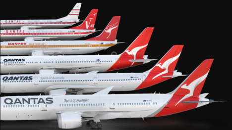
Qantas redesign more than a superficial makeover, insists airline and design agency
Qantas has insisted its new logo and livery unveiled yesterday is more than just a superficial makeover as the agency behind the new look suggested decorative change for the sake of it was the worst mistake any brand can make.
Stu O’Brien, chief executive at Houston Design, who worked on the design with Qantas consultant engineer Marc Newson, warned against self-indulgent rebrands, arguing it could spark a “backlash” from “savvy” consumers.
Speaking with media after Qantas unveiled the new design – which includes new typography, a tweaked tail-fin and the introduction of a retro roo under the cockpit – O’Brien said any new design should reflect wider changes or improvements within an organisation.


Useless corporate decision making in action.
Its not a kangaroo, and the typeface is block against a racy kangaroo. Designers trying too hard – some things are better left slightly iterated.
The mere fact they are having to deny it’s change for changes sake….
I don’t care much for the rebranding itself, and many of the applications are a derivative of other airlines (retro roo under the cockpit = Virgin’s flying lady). But has the rebrand also dropped the plane naming convention on the fuselage?
That aside, the jargon filled justification from the branding — or is that product-experience-storytelling-agency — is up there with the infamous Arnell explanation of the Pepsi logo.
Just be honest, it’s a refresh. It doesn’t need to be buried in strategy and purpose.
What complete and utter rubbish, bollocks, tripe, s…, cobblers . . . pick whatever word you like, in what ever vernacular you like, but it will still mean the same thing. This new rebranding is a completely unnecessary waste of money and time. Tell me what are you rebranding, is it not QANTAS anymore? If not then why is the name the same? The flying kangaroo, the most recognisable logo in all of aviation and one of the most recognisable logo’s in all of business world wide, seems somehow to have offended the management, who have contracted at great expense an advertising agency to come up with a superficial rebranding, (the very thing they deny), of the most recognisable product on the market anywhere in the world. To make matters worse the spirit of the kangaroo now has more in common with the Nike swoosh than the classic marsupial. What arrogance and contempt you must have for us the flying public. If anything needs rebranding, perhaps it’s the management.
Looks like a pretty senseless rebrand. Knowing how egotistical marketing managers can be I would say they want their stamp all over Australia’t iconic brand. Since Olivia has been only at Qantas since 2009 I would say she wants to make her mark.
I honestly prefer the Hulbosch design, and the New Q looks like an O from distance, not enough emphasis on the curl. Heres to OANTAS!
I don’t mind the new Kangaroo, but how can a Kangaroo box without arms?? 😉
Its starting to look more like a tear in the skin than a roo.
Terrible re-branding. Qantas executives made a big mistake by changing the iconic ‘roo into a Nike swoosh & by dumping their fleet of 747s for B789s ( a money saving ploy). New B747-800s would have been the wiser solution.