Energy Australia launches new brand identity

EnergyAustralia has created a new brand campaign to promote the integrated brand following the merger between TRUenergy and EnergyAustralia in 2011.
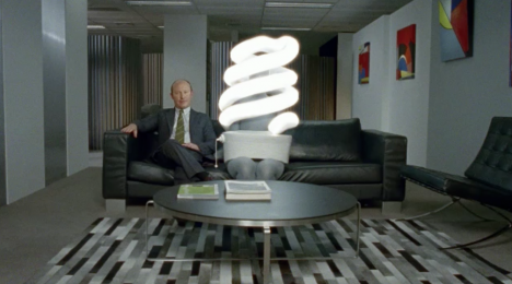
The campaign features a series of tongue in cheek TV ads in which representatives of the utility try to discover how consumers are using electricity.
The campaign will run across TV, online, in press, outdoor and in cinemas. The electricity and gas company has a new logo and brand identity created by Leo Burnett and is a very different look and feel to the previous work created by the agency for the brand’s Olympic swim team sponsorship.


Maybe it’s just me, but does this remind anyone else of the iSelect ads?
great news is we will not have to see that god-awful Tru Energy abortion of a logo anymore – horray!
BTW – the ad itself has confused messaging ….good to see no copywriter put their name against it. The strategy is shoddy.
I don’t get the bit with the person being catapulted away – I know whacky stuff can help make an ad stand out and be more memorable, but I just don’t get the catapult so the whole ad doesn’t make sense for me.
TRUly awful hot mess of an ad… no strategy, no charm… just plain awful and even worse incredibly forgettable… Guru Todd asleep on this one??
Looks like an attempt to ‘scrub up their ‘green image’ while they hike up costs to consumers. Regardless of how clever, or in this case, not so clever, the advertising is, if they can’t win trust, and save costs with the consumer – then this is a waste of air time.
Yep. Two energy brands merge, becoming the catalyst of a new brand identity. The ad looks to be clutching at straws to provide a tangible benefit of this change though. There’s some line about ‘heading out to see how customers use their energy’. Huh? Where’s the benefit there?
Energy Australia??? They are chinese owned!